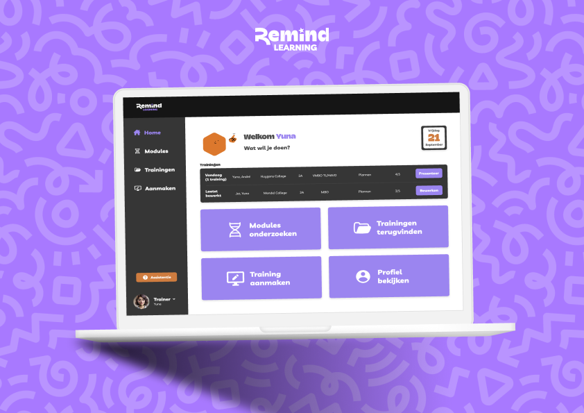
A new platform
Remind Learning’s mission is to transform schools into environments where students learn effectively through experimentation. They achieve this through fixed modules designed to help students be smartly themselves. Currently, trainers and mentors use various external platforms to deliver these modules. Since Remind wants to become less dependent on external platforms, I became involved as a trainer and UX designer to explore what a dedicated platform could look like. During my graduation project, I investigated the possibilities and created a fictional platform for them as a starting point for a potential next step.
Project focus
Remind Learning wanted to consolidate their four external platforms into a single platform to deliver training and mentor sessions more efficiently. As a UX designer, I focused on improving the experience of stakeholders, starting with trainers and mentors. After analyzing user tests, the original design challenge was revised.
Although the desire for a central platform was confirmed by frustration over switching between multiple platforms, the biggest pain point turned out to be the negative experience of creating and delivering presentations.
Based on these insights, the project focus was adjusted: the new main objective is to address the issues related to creating and delivering presentations. The client identified the slide editor and presentation function as core features, while the preparation and evaluation phases were included with lower priority to provide a complete environment for trainers.
Methods
Methods I used during this project
Throughout this project, I applied a wide range of research and design methods to develop well-founded insights and informed design decisions.
Fly-on-the-wall observation: I unobtrusively observed users to identify natural patterns, problems, and needs.Jobs-to-Be-Done interviews: By exploring the underlying “jobs” users aim to accomplish, I gained insight into their functional, emotional, and social motivations.User tests: Across multiple testing rounds, I presented prototypes to users to validate assumptions and reveal usability issues.Patterns in current user behavior: Through analysis of interviews and observations, I identified recurring behavioral patterns and pain points.Personas and an experience map: I created personas and an experience map to visually clarify the user journey.Surveys: Additional quantitative data helped reinforce and validate the qualitative insights.Requirements (MoSCoW): I prioritized the project’s requirements using the MoSCoW method to maintain focus throughout the development process.HKJ’s and brainstorming sessions: Using various brainstorming techniques, I generated a wide range of ideas and explored new perspectives.Trend analyses: I examined relevant trends to identify opportunities and ensure the design would be future-proof.Clustering and dot voting: I organized and prioritized insights and ideas to define clear directional choices.Function map: The function map helped structure potential functionalities before moving into sketching.Design patterns & existing solutions: By analyzing established solutions and best practices, I gathered inspiration and guidelines for a user-friendly design.Figma design of a happy-flow prototype: I designed an ideal-flow prototype in Figma, which could then be tested with users.Tested with real users: This provided realistic feedback and validated the feasibility and usability of the design.Bias analysis: I examined and mitigated potential biases in both my research and design process.Future perspective: I developed a logical, step-by-step outlook on how the concept could evolve in the future.Ethical and societal reflection: I reflected on the design’s implications for users, including privacy, inclusivity, and broader societal impact.